The structure nearing completion (as of February, 1963) in the physical education sector of the Forman Christian College campus has the distinction of having been praised and condemned already in the strongest terms possible by the large number of amateur critics who have observed the growth of the building. Adverse reactions go so far as to compare it with a third class waiting hall or a stable. Favourable comments are inclined to reflect as unrestrained a response on the other side. It would be safe to say, at the least, that the appearance of the building has not passed unnoticed.
The concept of the Lucas Student Centre originated in the Report of the Commission on National Education with its emphasis on the need for developing facilities for students on a larger scale than hitherto existed. The willingness of the Government of Pakistan to make funds available made it possible to bring this multipurpose building into existence, while the creative planning and design of the Engineering Department of the United Christian Hospital, under the guidance of its head, Mr. Le Young, gave form to the vaguely conceived ideas of the college planners. The movement from concept to completion is almost finished.
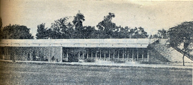
Mr. Young has designed a building that provides the Physical Education Department with an outdoor gymnasium, playing court, shower and locker rooms and an office. Part of the building houses community service facilities, such as barbering, tailoring, cycle repairing and a book and stationery shop. Refreshment rooms will be confined to a tea shop and fruit shop for the present, although further expansion is possible which would include a full cafeteria system dining room and kitchen. Student and staff lounges and further office space are included. Finally, the roof has been designed as a tiered stadium for both the athletic playing field in front of the Centre and the enclosed gymnasium within. Lighting has been provided for night games and functions.
The design of the Centre is a major point of controversy. The person who has seen the building may be somewhat startled by the claim that the design does conform to the standard set by Mughal architecture and follows some of its major principles, if these are accepted as consisting of a sense of austerity, formality, balance, colour and, finally, the architectural value of sincerity.
With respect to the first two characteristics, the building clearly suggests a formal and austere design. The long straight line and the severe 90° angle dominate the structure.
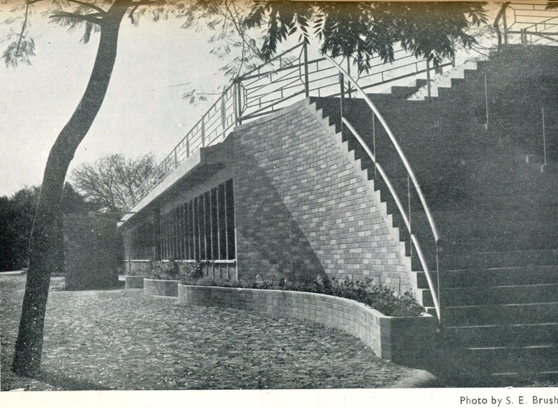
Balance is achieved in a manner quite different from that used by the Mughals. Shahjahan thought of balance as symmetry; in the Student Centre balance is achieved by contrasting curved lines with straight, and larger surfaces with smaller at varying distances from the centre line. The curved bulbous dome provided by the Mughal builders with a balancing element in an otherwise severely square structure. The Student Centre uses a curved staircase wall, a sinuous flower box and a curved perforated brick screen. The design function of the flower box is to tie together the curved staircase and the main building, while the staircase, itself, is balanced by the brick screen on the other side of the centre line. The total effect is quite pleasing.
The basic colour of the building is the grey-white of the reinforced concrete structural members. Contrast in colour has been achieved in the use of coloured concrete bricks of Mr. Young’s own manufacture and the painting of various concrete and wood surfaces. A wide variety of colours has been used. Doubtless different colour schemes will appeal to different observers. Gone is the flat uniformity of the red brick and whitewashed wall.
Sincerity as an architectural virtue refers to the way in which a building proclaims its function and the nature of its construction. No attempt has been made to make the Student Centre like anything but what it is, a multipurpose activities building. Reinforced concrete structural members are visible, revealing solid graceful strength in construction, bricks are visible and plastering has been kept to a minimum. This is in contrast to the way in which plaster has taken over some Lahore houses, which look like cement frosted cakes.
The Student Centre, with its hand-finished appearance, is an example of the high quality work possible when the entire construction team from the architect to the labourer is inspired by the act of producing something new and beautiful.
Source of text and image: S E Brush, The Folio, FCC Magazine, March, 1963


